Project Overview
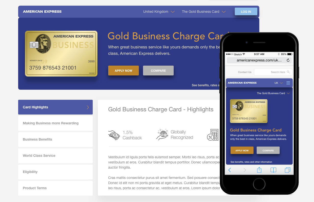
InRhythm needed to create a UX analysis POC to convey to American Express how their UX team (s) could improve the americanexpress.com digital experience. I was contracted over the course of 5 days to analyze the 2016 American Express website, present my findings and hopefully land InRhythm an increased presence at the clients New York location.
Problem Statement
American Express requested a POC from InRhythm for their international business card form. The application was buggy, had user flow challenges, usability challenges and was outdated.
Project Goals
Create recommendations for American Express based on the audit of their business card landing page and the application process.
Minutes Pushed
Pages Compared
Wireframes Created
Team
The POC took us 5 days and consisted of myself and Amit Desphande, the director of UX at InRhythm.

Steve Joseph
Sr. UX Designer
I was responsible for doing the audit, comparative analysis, wireframes, and UI exploration. Working with Amit allowed quick validation of UI and strategic hypotheses.
First things first…
I jumped on a call with Amit to discuss the project one more time before starting even though I had spoken to him and InRhythm before. I wanted to confirm:
- His expectations, short term, and long term.
- How InRhythm was defining success for the effort.
- If there were any other insights I missed in my previous notes to make this as successful as possible.
Audit
The process was started by auditing the existing site for common usability and heuristic issues while keeping an open book for key opportunities (SWOT analysis).
Core pain points – “Highlights” and some CTA’s (Call To Action) are larger than the “Apply Now” CTA. Visually busy. The page is not responsive whereas other pages within the experiences are.
Visual (UI) challenges – The design of the page is not consistent with other areas of the American Express experiences or the user profile/account section for an existing cardholder. The card tray UI pattern could be a drawer, accordion or tabs so that it’s not displayed once the user has selected the card they would like to apply for. The information below could also live in an accordion thus creating the feeling that the page is shorter than it actually is and which would seem less overwhelming to the user. The UI patterns, actionable colors, and overall visual design could be modernized.
Core pain points – The layout of the overlay can be restyled to convey importance. Important Documents opens new tabs or browser windows. The close button is covered by the browsers scroll bar. No availability of chat.
Visual (UI) challenges – Better UI patterns and formatting needed.
Core pain points – Longer than normal page length due to form field length. Inconsistency in error handling and save & continue behavior. Live chat, if available in the UK like in the US should be introduced here as per the notes and source information on slides 1 and 2.
Visual (UI) challenges – All UI patterns should follow a consistent theme and usability best practices.
Core pain points – Some fields seem redundant or duplicates of earlier ones. e.g. Flat number vs House number, Type of Business. Error message handling continues to not follow key usability standards. Fields are longer than need to be creating a longer form when it is possible to reduce the height of the form by several hundred pixels or more.
Visual (UI) challenges – The error handling could be confusing to an applicant. UI pattern styled like an input field
Core pain points – Similar issues in page length due to field length, UI patterns not consistent with usability standards and error handling that does not follow specific industry best practices.
Core pain points – Some users may find it inconvenient to have to fetch the required link from their email client. It disrupts the user flow and process. There should be a “need more time” dialog or some notification (consider making it audible as well) they can visibly see if they are still within viewing distance of their screen can be helpful here.
Core pain points – The applicant may falsely believe they have completed the form at first glance because a check mark is displayed at the top of the page immediately after they left a review page. In most E-commerce checkout processes the user reviews their information before final submission of the order. That’s the established mental model. The progress bar might be a false visual indicator of completion of the application.
Furthermore, the user should have clear buttons with labels that allow them to “go back, “cancel” and submit”.
Core pain points – By only supplying buttons to “print page” and “return to homepage”, American Express misses out on an opportunity to evoke the picture superiority effect and amplify the context of the “print page” action. Not helping, is the lack of a message confirming that the form was successfully completed. This is odd since we noticed in the previous step that a large checkmark (in the users mental model for success) was used there. Why not here?
Conclusion
The POC (Proof of Concept) analysis work was well received by American Express, allowing InRhythm to deepen their presence with the client at the Amex NYC location. After the POC work I spent 2 months onsite with the company before having to return to Hudson Rouge.
Here are some things I would have liked to have pushed for in my work and what I saw at American Express.
- Improved team collaboration. UX is the entire user journey from end to end, not parts of it in isolation.
- Closer adherence to system heuristics.
- A stronger push for adhering to usability standards when creating forms and user journeys.
- Better measurement of new technologies and hypotheses to verify whether they can indeed improve the speed of the sign-up process.


